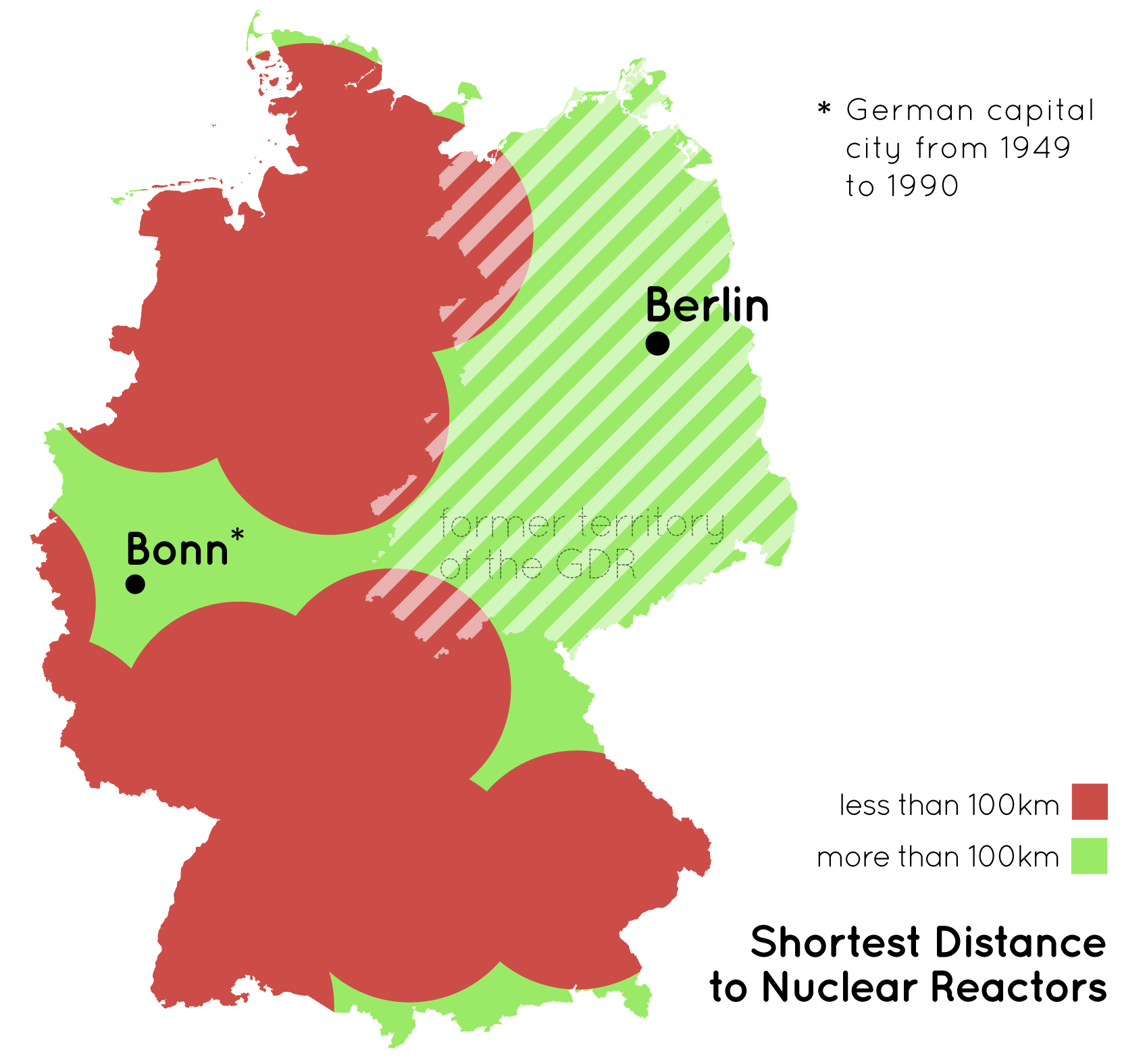
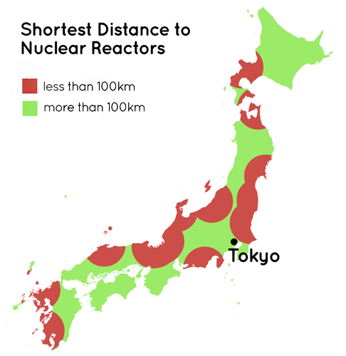
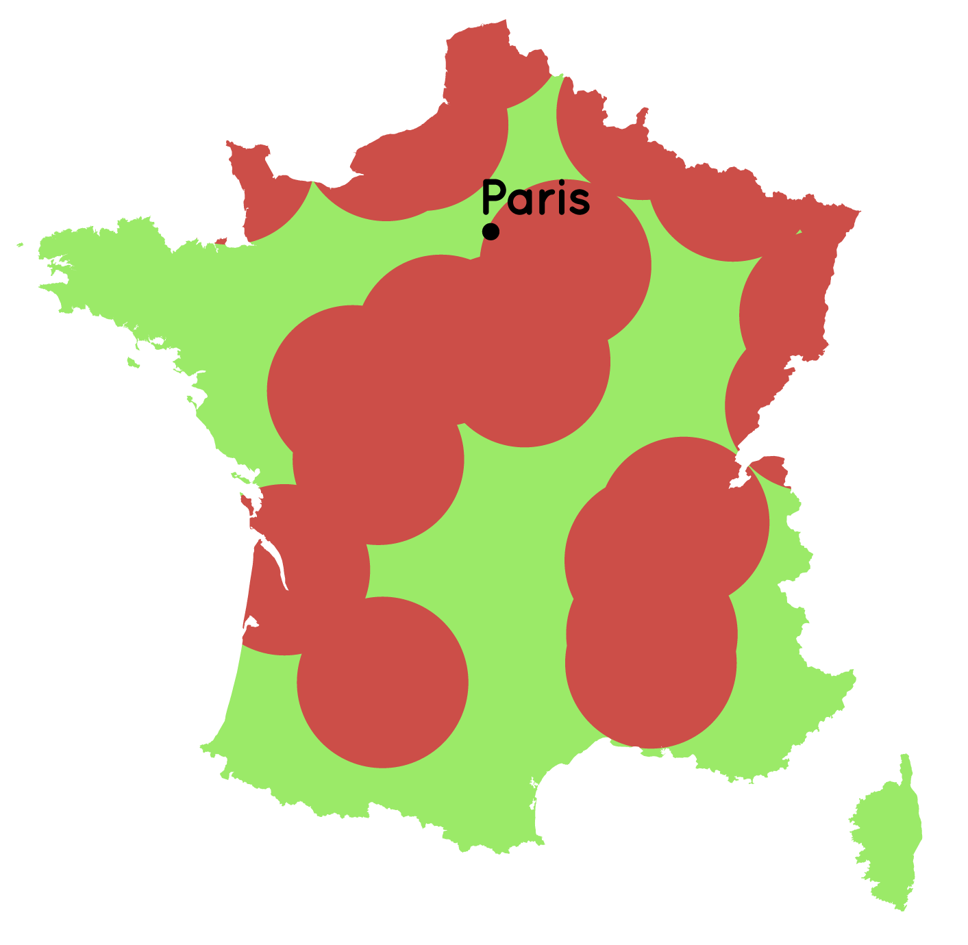
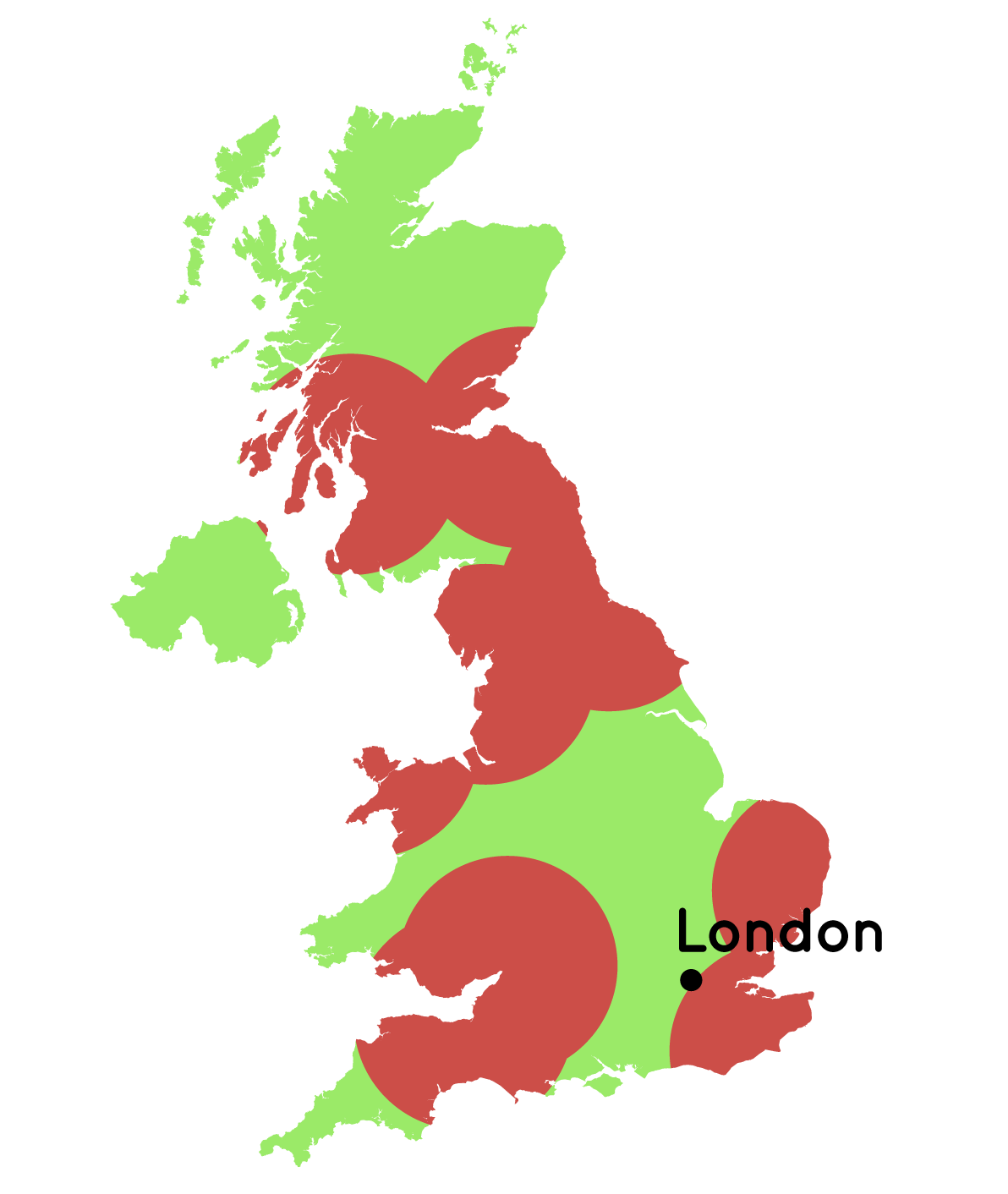
Distances To Nuclear Reactors
Shortly after the Fukoshima catastrophy in March 2011 I was very interested in the geographic patterns of nuclear power. This map series simply divides the area of a country in regions that are closer than 100km to an active nuclear reactor (red) and those who are not (green).
This idea formed the basis of an interactive infographic I created for ZEIT ONLINE a few days later.
Appeared on vis4.net