G.O.P. Debate Live Charts
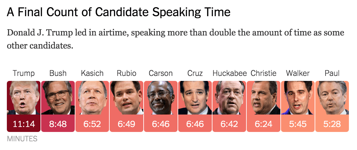
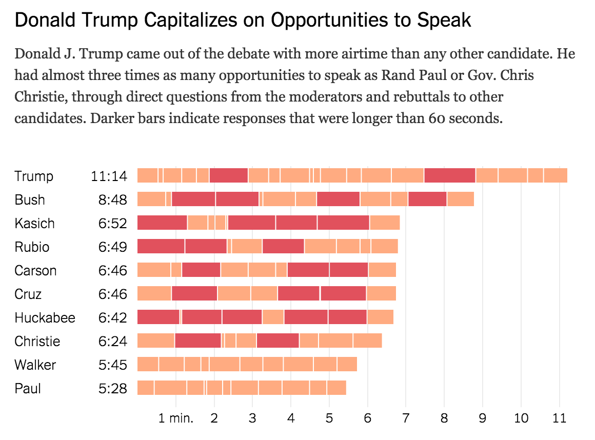
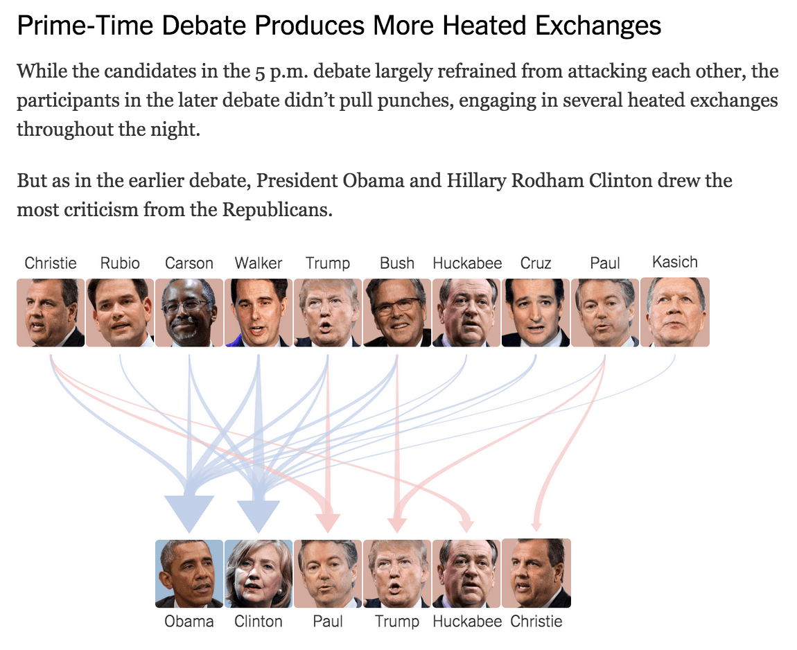
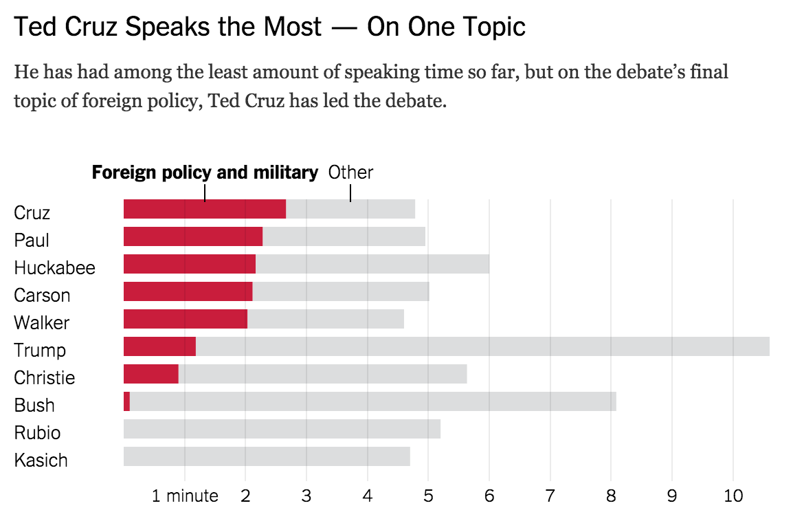
During the first TV debate of Republican presidential candidates on August 7, we measured the speaking times and topics for each candidate, as well as who they attacked in their speeches.
This data was fed into a tool that we built to produce live charts for [live coverage]([object Object]) of the event.
Donald Trump got almost twice any much air time than some other candidates and more than three times as many speaking opportunities.
In collaboration with A. Parlapiano, J. Ashkenas, A. Tse, K. Soften, T. Giratikanon, Nicholas Fandos & K.K. Lai.
Appeared on The New York Times
