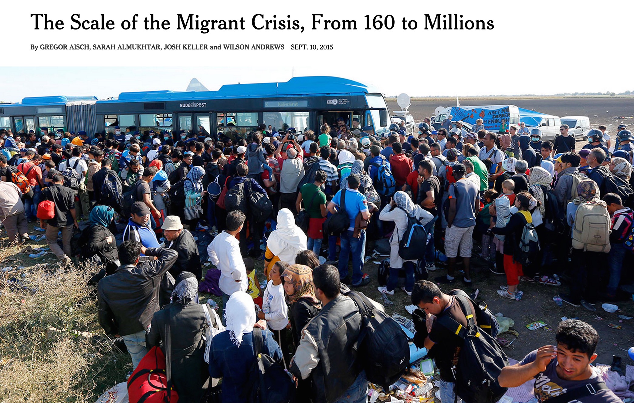
The Scale of the Migrant Crisis, From 160 to Millions
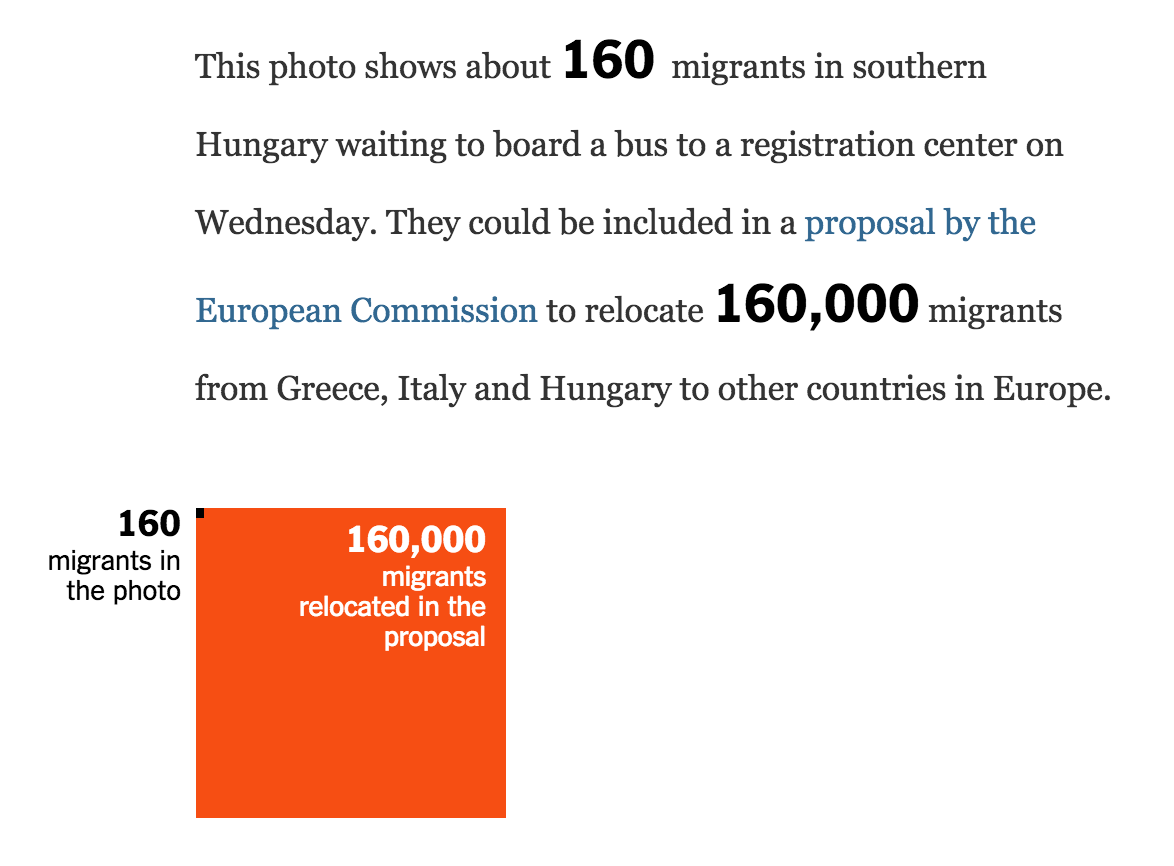
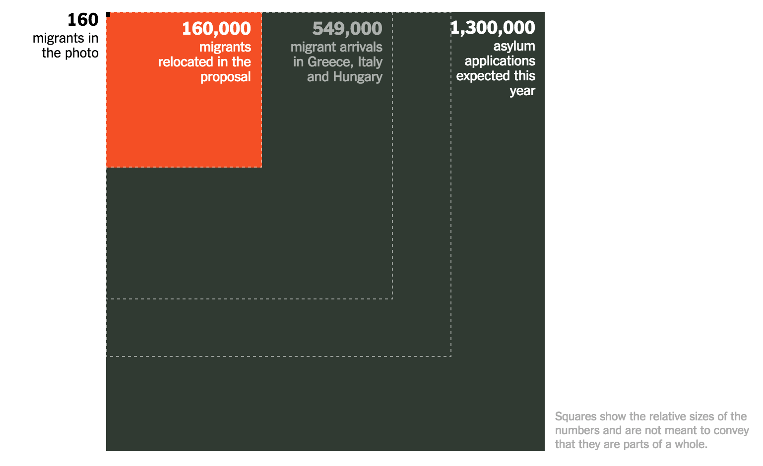
Lots of numbers are being tossed around in the coverage of the migration crisis. So we thought it’s time to put them on a scale to show proportions and allow better comparisons.
The piece is based on a simple, single idea, so we tried to keep the form as simple as possible, too. After reporting out the numbers and deciding to use nested squares to represent them, the overall production took less than a day.
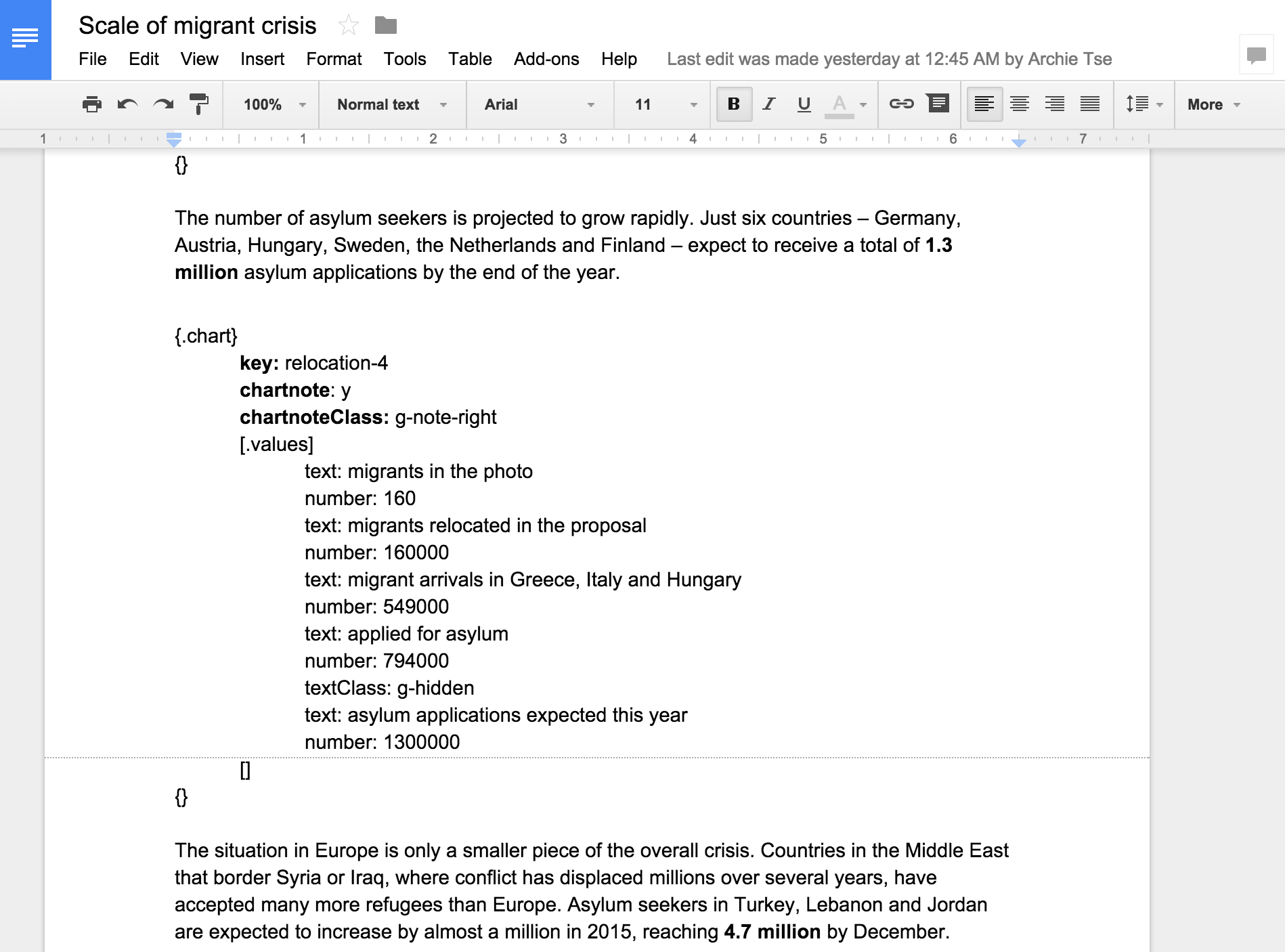
This is made possible in large part by using an ArchieML Google document as CMS, a screenshot of which is at the bottom. It allows collaborative editing while still being flexible enough to include the entire data structure for the visualization.
Appeared on The New York Times


