Where the Race Has Shifted
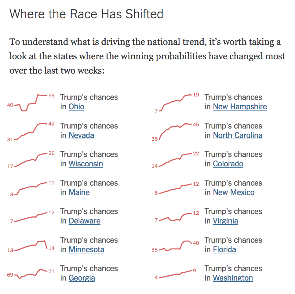
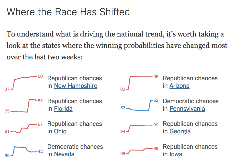
This update to our election model pages adds little sparklines that show (and link to) the states where the race has shifted the most over the last 14 days.
The tweet I sent to announce the update provoked an interesting debate about the usefulness of sparklines in general and some rare insight into the debate culture of the datavis community on Twitter.
In collaboration with Josh Katz.
Appeared on The New York Times

